Is sketching new ideas 📖✏️
Is probably at the gym 🏋️💪
Is tuning his guitar 🎸🎼
Is teaching design 🧑🏻💻🎨
Is styling his outfit 👔🥾
Is meditating 🧘🏼✨
Is capturing candids 📸✌🏼
Is sketching new ideas 📖✏️
Let's connect
hello@bharatchhatwal.com
Email copied!
Is sketching new ideas 📖✏️
Is probably at the gym 🏋️💪
Is tuning his guitar 🎸🎼
Is teaching design 🧑🏻💻🎨
Is styling his outfit 👔🥾
Is meditating 🧘🏼✨
Is capturing candids 📸✌🏼
Is sketching new ideas 📖✏️
Let's connect
hello@bharatchhatwal.com
Email copied!
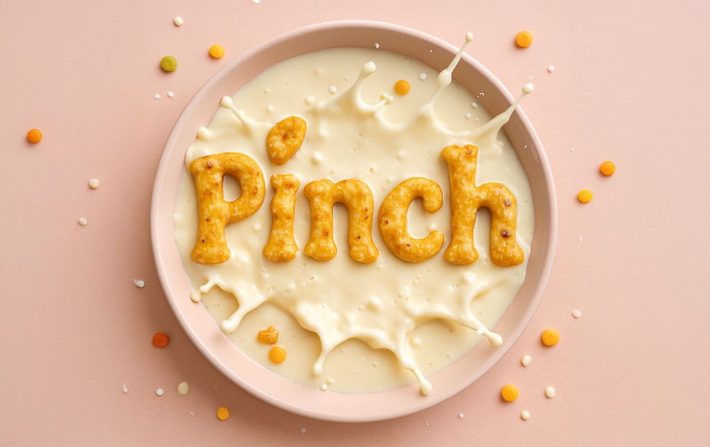
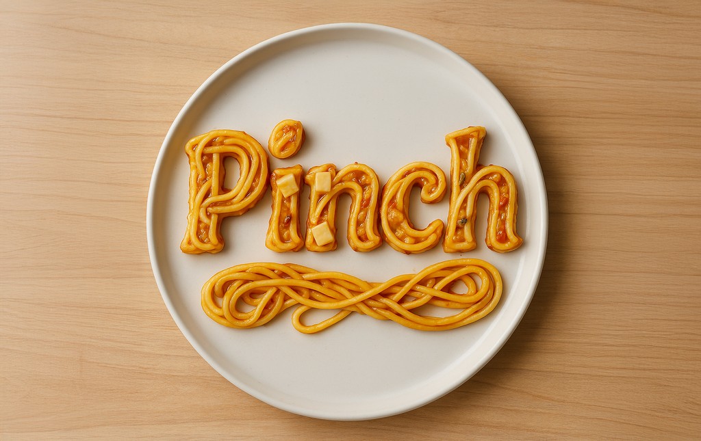
PINCH

Designing a Smarter Approach to Planning Meals
About Pinch
As part of my capstone project, I worked with a team of five others and me to design a meal planning app that simplifies the process for busy individuals. Our goal was to create a personalized and user-friendly solution that includes curated recipes, grocery lists, and nutritional tracking. The project focused on solving real-world challenges through collaborative research, thoughtful design, and innovative problem-solving.
ROLE
UI/UX Designer
TIMELINE
60 days
Team
Bharat Chhatwal
Christine Schramm
Elizabeth Valentine
Jacob Dale Smith-Robinson
Nitin Vadnala
Stephanie Anderson

CHallenge
In today’s fast-paced world, where work and household demands overwhelm schedules, many struggle to plan and prepare healthy meals. Our goal was to create a versatile meal planning app that simplifies this process, helping users save time and maintain a nutritious diet.
User Research Objectives
User Research
Objectives
Insights into user behaviors and pain points to identify patterns.
Evaluate user needs and preferences to find areas of improvement.
Test and validate market assumptions to refine the product direction.
Gather targeted feedback to prioritize development areas and better connect with the audience.
Competitive Analysis & UX AUDIT
Competitive Analysis
& UX AUDIT
To better understand the meal planning app landscape, we analyzed three key competitors—Mealime, Yummly, and Eat This Much. These apps were selected based on their strong market presence, diverse feature offerings, and alignment with our target audience’s needs. Each app provided unique insights into user engagement, feature design, and pain points, helping us identify opportunities to differentiate our solution.


DESIGNING SURVEY
DESIGNING
SURVEY
We conducted the survey to validate online research insights, reach a broader audience, prioritize key features, and uncover unmet needs. The data-driven approach ensured our app development aligned with user preferences and satisfaction.


SURVEY INSIGHTS
SURVEY
INSIGHTS
Users need a personalized, budget-friendly meal planning solution that reduces stress, inspires ideas, and simplifies grocery shopping. The product should offer tailored plans, automated grocery lists, and time-saving features to meet these needs effectively.


USER PERSONAS
USER
PERSONAS
We created two personas to represent key user groups, highlighting their goals, motivations, and frustrations. This helped us design features tailored to their unique requirements and improve their experience.


EMPATHY MAPPING
EMPATHY
MAPPING
To deepen our understanding of user needs and behaviors, we created empathy maps based on research insights. These maps helped us visualize what users say, think, feel, and do, enabling us to design solutions that truly resonate with their experiences and challenges.


MVP Feature Prioritization
MVP Feature
Prioritization
We assessed all identified features using a Prioritization Matrix to balance user needs with technical feasibility. This was followed by a MoSCoW prioritization to focus on high-impact, feasible features, ensuring a user-centric and timely MVP launch.

Must
Feature
Reasoning for prioritization
User onboarding to select preference of likes, dislikes, nutrition, cuisine, dietary needs, and serving sizes that will be used to inform meal plan generation.
In part, this feature meets our identified need to offer service customization to users. It takes into consideration the user’s wants and needs to curate the content they are shown.
A categorized library of recipes.
This is a key feature of several competitors, and one that our users expected per our testing results. Additionally, having an organized library contributes to an overall better user experience.
Extensive search filters.
A way to organize content on the site plus enables the capability for users to sort and personalize what content they want to look at.
Saved recipe collection (user favorites).
Saving recipes allows for users to easily re-visit content, saving time as well as allowing them to build a ‘library’ tailored to their needs.
Ability for user to upload their own recipes into the app.
Another way to allow an element of personalization in the app. We found in our user testing that ‘personal recipes’ is a top category in which individuals decide what to cook.
Detailed recipe instructions and education on ingredients, cooking techniques, and skills within the recipes directly.
Simplified cooking steps and the needs to be less time-consuming and stressful are top ranking needs by users per our test results.
Customization of recipes based on food preferences, dietary needs, and serving sizes.
Similar to the onboarding feature, this adjusts to a users needs and customizes the planning process on more unique scenarios.
Meal planning features (supports auto-generating meal plans).
Eliminates the stress of meal planning by taking the task off of users task load and automating the process, saving them time and stress. A key feature that users thought would be most useful i.n our testing results
Ability to edit recipes.
An additional way to add customization in our experience, by allowing users to personalize recipes to their own taste.
Generate grocery lists based on recipes & meal plan.
Helps alleviate the stress of meal planning and have the technology to support a user’s time and cost management needs. Our testing showed users focusing on food waste and budgeting in addition to meal prep.
Basic nutritional tracking.
A key feature that users indicated would be especially useful to them. We also found that a primary pain point was that many users felt stressed trying to plan balanced, nutritious meals.
Offer new users a free trial, low-cost monthly subscription.
Not design specific, but a mindful key key to engaging users and generating revenue - users found price to be a huge negative factor to them using other food planning/recipe apps.
Accessibility across different devices.
We found that users utilize a variety of types of devices regularly. The desire to access our application from a various device types likely depends on the specific task a user is looking to complete (i.e. accessing a grocery list while shopping).
Profile & preferences.
A distinct and place to easily access and update responses to questions answered during onboarding.
Hands-free mode for recipes.
A unique feature that can also leans in to accessibility, this capability simplifies the cooking process for users by continuing to walk users through the recipe step-by-step while they are completing recipe tasks.
Accessibility related features (high contrast mode, screen reader).
Accessibility features were a major gap we found with our competitors. We see this as a way to differentiate our product and cater to all users.
Should
Feature
Reasoning for prioritization
High-quality recipe images throughout the recipe.
While visually appealing, images themselves are limited in the value they add to the user. We are prioritizing other functionalities over this feature; a curated selection of high-impact images will be chosen.
Browse/Explore/Discover tab - Pinterest styling (home page)/Instagram-style of inspiration (UI) for recipes.
We want to ensure user satisfaction in completion of tasks, therefore, prioritizing functionalities over stylistic decisions. However, we found that users are turning to meal planning apps for inspiration and this UI would help achieve that.
Smart, adjustable meal planner based on inputted daily consumption (feature can be turned on/off).
Detailed nutrition tracking was of interest to many users in our testing, but not universal. This feature will appeal to individuals that have strict diet needs.
Syncing and integration across devices & other grocery/food apps.
As we look to support all device types, we want to maintain a user’s experience accessing the application from different devices.
Low-monthly subscription without pop-up ads.
Pop-ups/ads were something we found in testing to be a repeated dislike of users across other apps. We want to eliminate the user expereince disruption that ads cause while maintaining viability.
Rating of recipes.
Assist users in making informed decisions and gives us some analytical feedback and insights into consumer preferences.
Could
Feature
Reasoning for prioritization
Blog and articles section that is topically based on elements users care about e.g.; saving money, finding new cuisines.
While this is an idea for inspiring users with new ideas and recipes, this feature was not specifically tested in our first round of user feedback. We need to better understand if this is a feature users truly want and will use.
Syncing with calendar apps to generate meal plans.
A way to automate and continue to save users time by planning meals with a user’s calendar in mind. Due to this being low in feasibility (for MVP) this is something that can be done in future iterations and a possible subscription feature.
Low-cost recipes + include price per serving.
Budget management tools were not ranked as a top feature users wanted to see in our testing, however, affordability was of importance to users.
Virtual pantry, expiry tracker & alerts when you are running low on ingredients.
A feature that was not ranked as a top feature, but was of interest to several that completed our survey.
More advanced nutritional tracking (such as micronutrients).
While nutritional tracking was a feature that was of high interest to many users, this level of detailed tracking may be less desirable. Additional user and engagement info is needed to inform whether or not this feature is in demand.
Won’t
Feature
Reasoning for prioritization
Meal plans based on available ingredients (using AI) - zero waste mode.
The ability to incorporate AI is a large technical lift and is not in scope for an MVP product.
Step-by-step video instructions.
The resources and time to build out video based instructions is sizable and will not be done as part of a MVP launch. However, the idea will be backlogged as it could be a key feature for user engagement.
Promotional campaigns and annual discounts.
Certainly a priority beyond MVP launch of the product, but not necessary in order to launch/make available our application.
INFORMATION ARCHITECTURE
INFORMATION
ARCHITECTURE
The IA was designed to ensure seamless navigation and an intuitive user experience. It organizes key features into structured sections, allowing users to efficiently browse recipes, plan meals, track nutrition, and manage shopping lists. The hierarchy prioritizes accessibility, with clear pathways for core actions such as adding meals, customizing preferences, and tracking dietary goals.

USER FLOWS
To create a seamless experience, I mapped out key interactions that simplify meal planning in Pinch. From onboarding to hands-free cooking, each flow was designed for efficiency, personalization, and ease, ensuring users can plan, shop, and cook effortlessly.


BRANDING
Pinch’s branding embodies simplicity, warmth, and functionality, making meal planning effortless and engaging. The custom logotype, with a playful leaf detail, reflects freshness and approachability. A vibrant color palette, inspired by fresh ingredients, adds energy and balance, while modern typography ensures clarity across all touchpoints.


WIREFRAMING
For Pinch, a comprehensive wireframing process was carried out to define structure, user flows, and interface hierarchy. Over 50 screens were designed to cover all key user journeys across the app.

LOW-fidelity wireframes
LOW-fidelity
wireframes
Low-fidelity wireframes were used to explore layout options and validate content hierarchy. These quick, grayscale sketches allowed for rapid iteration and early alignment on core functionality and navigation patterns.

HIGH-fidelity wireframes
HIGH-fidelity
wireframes
Once the structure was finalized, high-fidelity wireframes were developed to reflect the visual design direction. These detailed screens included refined layouts, consistent spacing, and component behavior—serving as a strong foundation for the UI design phase.


Pinch was developed as part of the capstone project for the UI/UX Design course by UT Austin. This experience was instrumental in applying end-to-end design thinking—from research and wireframing to prototyping and usability testing. Key takeaways included designing for real user needs, balancing functionality with simplicity, and building scalable design systems. It also reinforced the importance of continuous iteration and user feedback in shaping intuitive digital experiences.
More work this way


BHARAT CHHATWAL
Creative Director, presently shaping interactions at Adobe.
Move it around 👇🏼😉
USER
RESEARCH
UX DESIGN
VISUAL
IDENTITY
MOTION
GRAPHICS
STORYTELLING
WEB DESIGN

CURRENTLY CRAFTING
EXPERIENCES AT ADOBE
2023 - PRESENT 🎯👨🏼💻
My essential stack
A Complete Toolkit to Enhance and Streamline My Workflow.

Located in India
Let's connect
hello@bharatchhatwal.com
Email copied!
Let's connect
hello@bharatchhatwal.com
Email copied!